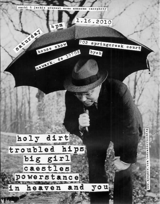
Cut and Paste Flyer
When I first started doing shows the year was 2000, and my mom certainly did not have Photoshop on our home computer. Instead, I made up flyers the old school, lo-fi way: cut and paste. No matter how many new filters they come up with in fancy digital editing suits, they just can't seem to replicate this aesthetic. While I've used Photoshop for the last several flyers I've made, I decided to return to my roots for my most recent creation. Admittedly, I cheated a little with the font. I don't own a typewriter anymore, and didn't have time to go cutting individual letters out of magazines, so I used a font-package, printed it in Word, and cut out the text. Still, I think it looks pretty authentic. I cut the background image out of a 1937 issue of Life. If you're in the area, come check out this free house show Saturday. It should be a memorably good time.


Comments
Post a Comment